Pantone's 2026 Color of the Year
Why Cloud Dancer Has Everyone from Design Professionals to Marketing Agencies Talking
Written by Cori Brooks, Senior Communications Writer
December 9, 2025
Every year, the design world holds its collective breath for one early-December announcement: Pantone's Color of the Year. Since 1999, the Pantone Color Institute has captured the cultural zeitgeist through color, analyzing everything from political movements to fashion trends to predict which shade will define the year ahead. It's become a ritual that sparks conversation, debate, and inspiration across industries from interior design to fashion to advertising.
But it's also brilliant marketing.
Pantone's annual reveal generates massive media coverage, drives consumer purchasing decisions, and influences product development across countless industries. Brands rush to incorporate the Color of the Year into their campaigns, retailers stock products in the chosen shade, and marketers leverage the selection to position themselves as trend-forward. It's a masterclass in creating cultural relevance while reinforcing Pantone's position as the ultimate color authority.
The Speculation and Anticipation
This year, like every year, design enthusiasts were abuzz with predictions for what shade will edge out the competition. Would it be a bold, eye-catching color like the Tangerine Tango, Emerald, and Radiant Orchid chosen in 2012, 2013, and 2014, respectively? Or would it follow the more muted, calming tone conveyed by last year’s Mocha Mousse? A lively shade of teal was considered the frontrunner in many circles, with a dynamic, optimistic energy perfectly suited for a world craving change and renewal. The speculation itself has become part of the story, as designers and color enthusiasts share their hopes and predictions across social media and spark conversation.
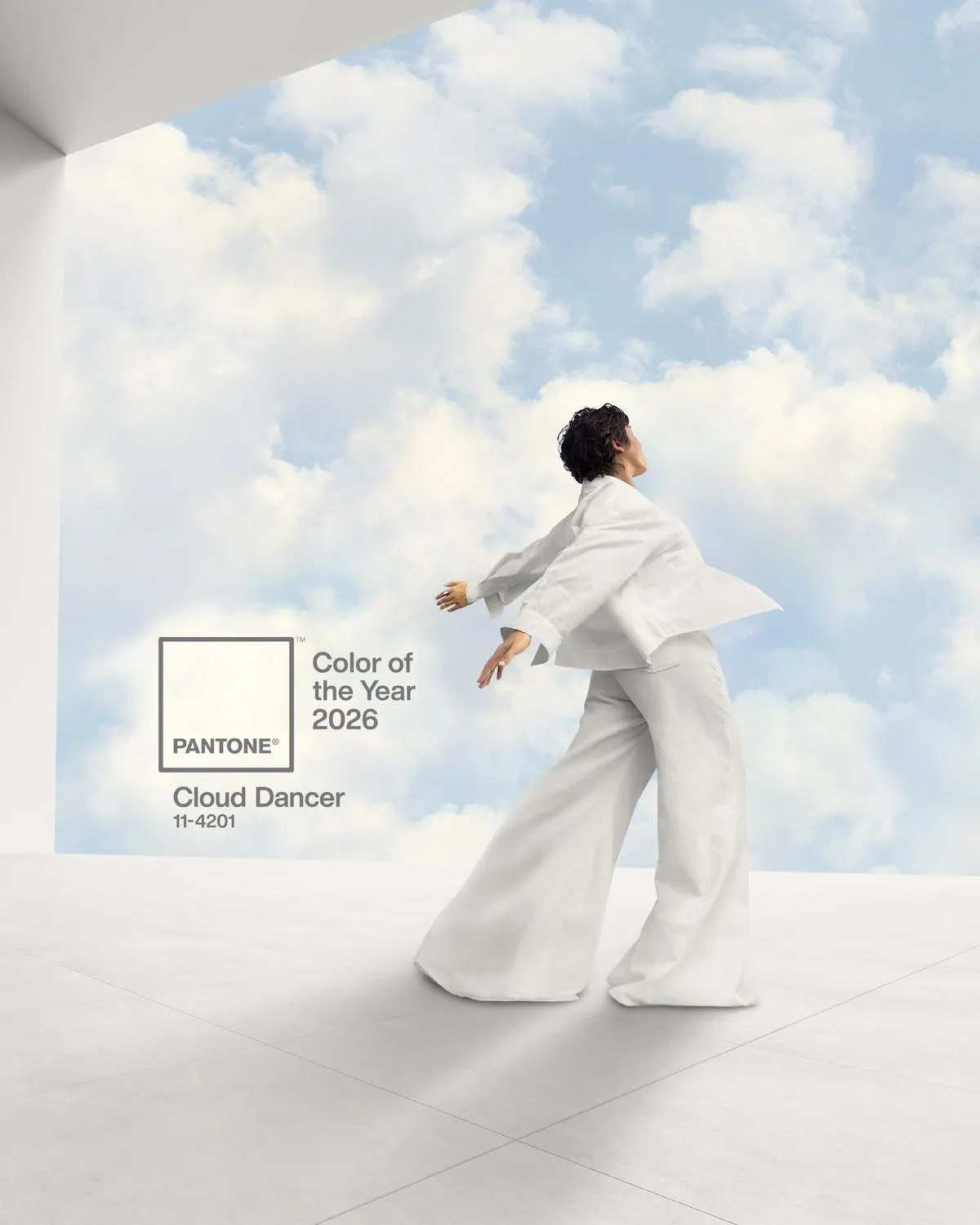
Then came the reveal: The 2026 Color of the Year is Cloud Dancer. A shade of white.
It’s Not “White,” It’s “Cloud”
The announcement of this balanced white, described as “possessing equal measures of cool and warm undertones,” represents a calming presence for our fast-paced, technology-saturated world. According to Pantone, Cloud Dancer embodies new beginnings and our collective desire for a fresh start, offering clarity without coldness and structure without severity.
“An ethereal hue, Cloud Dancer is described as a 'billowy, balanced white imbued with a feeling of serenity'. Marking a return to 'simplification', this lofty white shade acts as a whisper of calm and peace in a noisy world.”
– Pantone
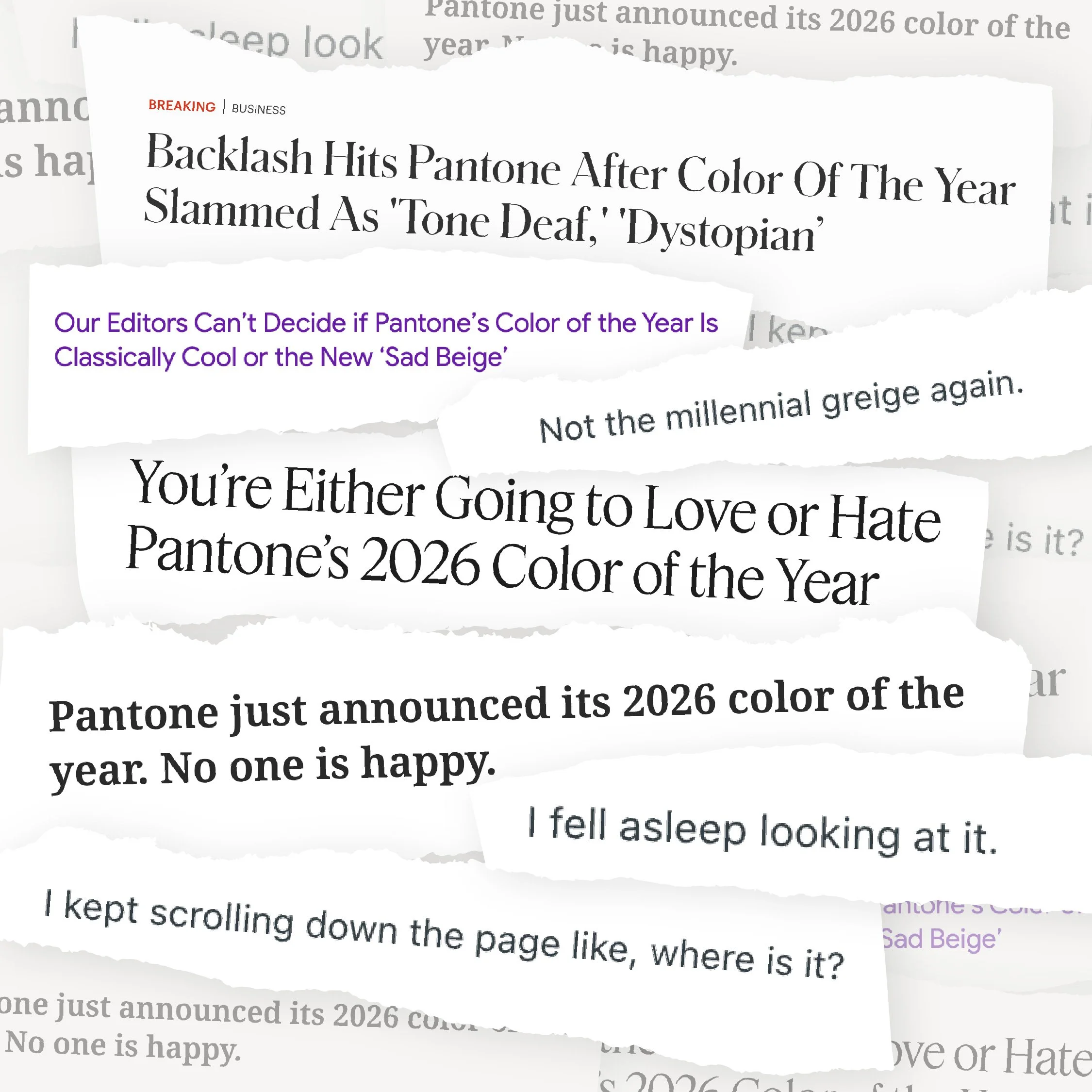
But, as we in this industry know all too well, even the most well-written, PR-approved product description can’t stop the reactions from coming in. Within hours of the announcement, the internet was flooded with memes, news headlines, and comments poking fun at the choice.
When we take a step back from the immediate reactions of, “Really? White?” and look at the choice from a marketing perspective, it quickly begins to make more sense. Cloud Dancer presents unique opportunities and challenges. Unlike bolder colors that demand attention, white requires thoughtful positioning. It's versatile enough to complement any brand palette, making it an easy entry point for companies wanting to tap into the Color of the Year trend without a complete visual overhaul. For brands in wellness, technology, and lifestyle sectors, Cloud Dancer's associations with serenity and new beginnings offer rich storytelling potential.
Our Reactions
Yet, there will always be skeptics who might question whether a white can generate the same excitement and product differentiation as previous years' more distinctive choices. So, as marketing professionals, how did our team react to this unexpected choice?
Creative Director, Oronde Vaughan, was one of the first to weigh in. “My initial reaction wasn't positive, but the more I thought about it, the more it clicked. As designers, we're always trying to prove that negative space isn't empty, but essential. It's what gives hierarchy, clarity, and balance room to breathe. Cloud Dancer taps into that. Its modern, understated feel can shape the space around it and lift a brand's primary color palette.”
Katie Sikorski, Senior PR Manager, had a similar journey. “My first reaction to Cloud Dancer was, ‘Really? It's white.’ But then I realized that's the beauty of it. It is simplicity with warmth and calm, a welcome feeling in the hectic world. The color is an elevated basic that can match almost any space and create a cohesive look, providing calm and comfort.”
However, not all of us were immediately convinced. Jessica Boyle, Account Director, was more skeptical of Pantone’s choice. “It's giving rental white walls meets Star Wars stormtrooper. You can give it a fancy name, but it's still just a shade of white.”
Katherine Reyes, Graphic Designer, was not thrilled, but she was optimistic about the possibilities. “I'm honestly not surprised that Cloud Dancer was chosen for 2026, but I'm still a bit disappointed. I personally prefer richer and brighter colors but given that 2025 Color of the Year was Mocha Mousse, I can see that neutrals are starting to become a pattern. Cloud Dancer is clean, soft and overall, the perfect base for any color palette which is very easy and versatile to design around. I still hope that they choose a bold color for next year, though.”
The mixed reactions from our team represent precisely what makes Pantone's annual announcement so fascinating. Be it a loud pink or a bold green or a true neutral, the winning color is always going to get people talking.
Cloud Dancer isn't trying to be bold or demanding. In a world of constant noise and oversaturation, perhaps the most radical choice is restraint. Whether you see it as sophisticated minimalism or just another shade of white, Cloud Dancer has already achieved what every Color of the Year should: it’s used something as fundamental as color to get us talking, thinking, and reimagining what's possible.